Entries Tagged as 'Interiors'

A Little More

37

11.1.12

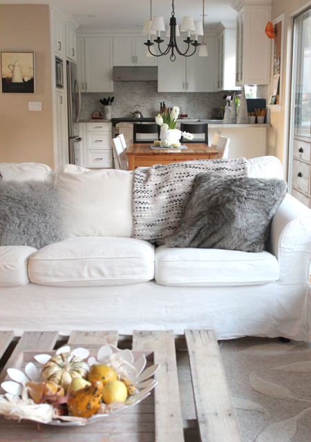
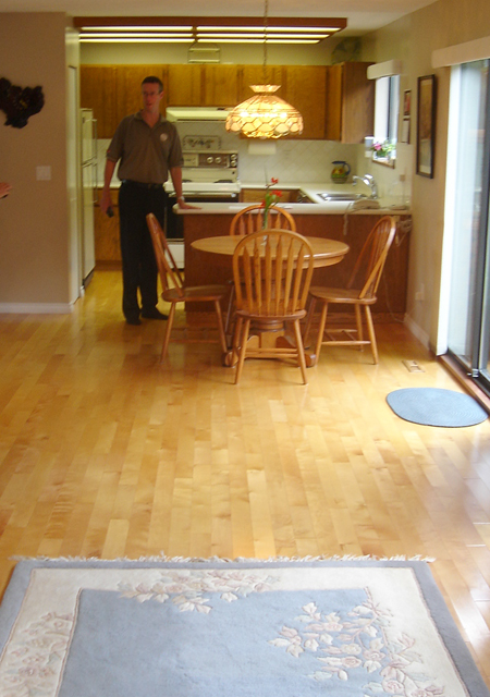
Check out the picture that I found from when the previous owners lived here, and before we tackled our kitchen renovation! It’s shows a little more of the room than you’ve seen before, so I thought I’d take some pics to show more of the family room/eating area/kitchen. I always hesitate to show too much because it’s a work in progress.

It looks kind of cramped in this picture, but I wanted the sofa to visually break up the long room, and I’m happy with the layout of the furniture. The beige wall on the left is currently the same colour as the rest of the walls, and now that they are all going to get a paint job I was thinking about trimming out and painting that one wall to match the kitchen cupboards. I think it would make the kitchen look a bit wider. What do you think? Keep it the same as the rest of the walls, or treat it like part of the kitchen??

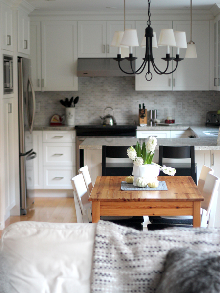
I haven’t shown a view of our eating area before because for the longest time we had no chairs! We borrowed chairs from the dining room while I was waiting to find the right chairs for the space… turns out they were waiting for me at Ikea all along! The table is a hand me down, and we’ve been searching for a long time for the right replacement, but can never seem to decide. And so it goes I guess! Life gets busy, and things fall to the bottom of the list if they aren’t completely hideous. 🙂

JuJu Hat DIY

11

24.5.11

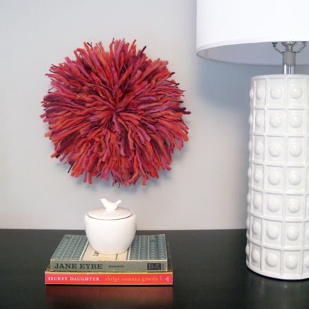
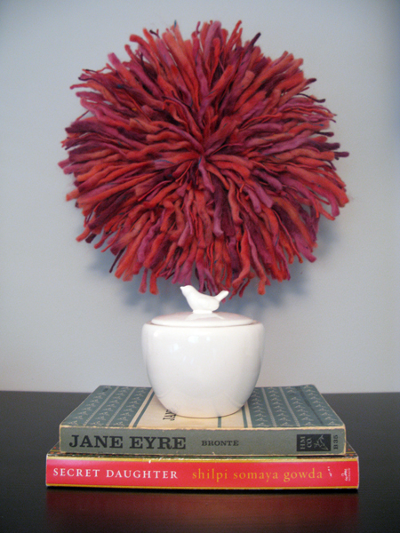
There are some benefits to having never seen a Cameroon headdress, or Juju Hat, up close and personal. If I had, then I may have been a bit more daunted to try and DIY this! For those of you obsessed with perfection, please squint when looking at the above pictures. ; ) Actually, I suggest everyone try that, since they do look pretty darn sweet in a somewhat blurry state.

When I was looking through my pictures of JuJu hats, they all seemed so textural, almost wooly. So, when I went on a field trip to Michael’s to see what kind of feathers they had to work with, I quickly changed course and headed over to the yarn section. (Partly because the price of feathers adds up very quickly, and partly because the lady warned me about just how long it takes to glue on feather upon feather upon… you get the idea. I’m all about the cheap and easy when it comes to projects that may or may not actually work out!) I do not knit, so I had zero idea what I’d find, if anything. I was surprised to find such beautiful colors woven together, and all the thickness and texture I was looking for! And, a new found desire to make myself a scarf for next winter… if I start now I may just have it done in time!

I’m working on a tutorial in case anyone else wants to make one of these wooly wall hangings. So check back tomorrow for that!

PS – Book club ladies, as you can see, I’m ready to go for the next two months! Jane Eyre is from my mom’s college days, so I’m hoping to make use of her notes! ; )

Photo Credits: Rosa Pearson Design

Life in the Living Room

7

14.4.11

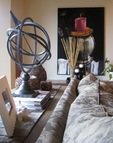
I thought that I should show you a section of our house that may be changing soon! Our living room is the first thing you see when you enter our 1800 sq.ft. home. We do a lot of living in here, so we try to keep it warm and casual, but it has been largely ignored while we’ve been doing renos in other parts of the house. See the artwork in the picture above? That was done by my amazingly talented aunt. I love how her large paintings fill our home with warmth.

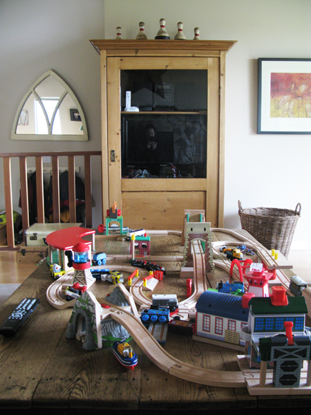
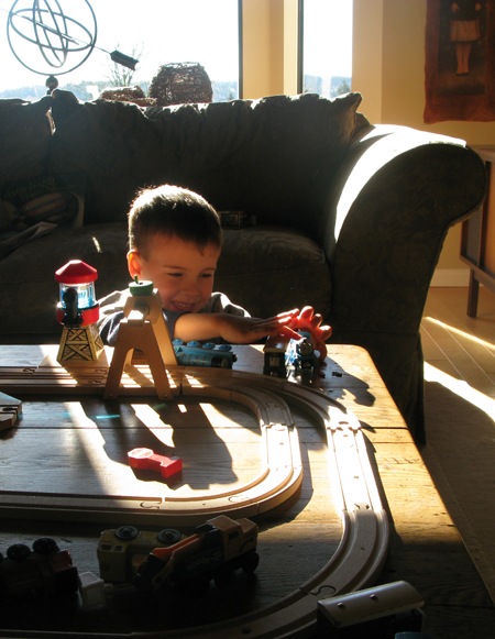
Our armoire stores our second tv, stereo for the kids, and Wii console. Large baskets in the bottom hold the accessories that come with it all! It’s invaluable to have a second area for the kids that I can close the door on at the end of the day. And the large basket to the right of the armoire makes for easy clean up of all the trains and tracks.

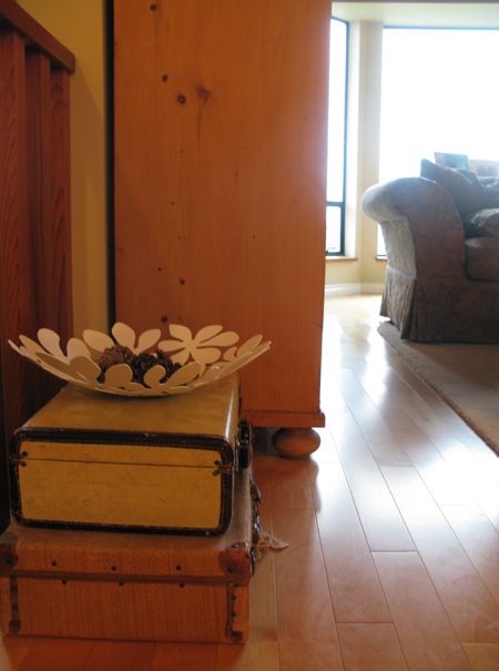
Vintage suitcases are so much fun to store toys in. I want to find at least one more of these, so let me know if you’ve seen one somewhere!!

PROBLEM WALL CURRENTLY:

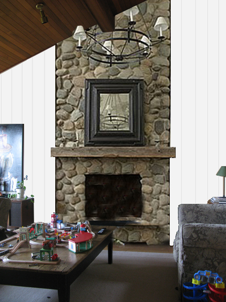
POSSIBLE AFTER:

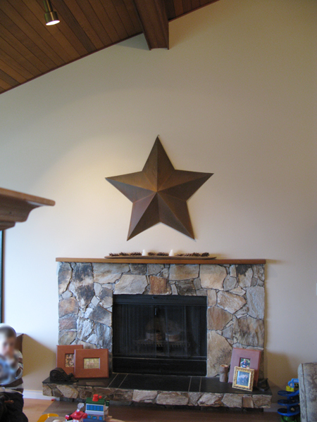
The two images above show the wall that has bugged me since we moved in. The rather ugly stone, super teeny tiny mantle, and large expanse of empty wall, etc. This is one of those projects that I had planned to tackle the moment the keys were in our hands… but other renovations keep being prioritized above it. I think this is going to be the year!

I threw this together in Photoshop so you can see what’s in my head for this side of the room. I’m thinking of adding some visual texture with wood trim, painting the whole space white, and a floor to ceiling stone fireplace. And a CHANDELIER!!! I’m very excited about the whole thing! What do you think? I’m imagining 1″ wood strips from floor to ceiling to give the look of board and batten siding without the expense of cladding the whole wall in wide wooden planks. Save some money for built in bookshelves or either side down the road! LOL. Any suggestions? Tips? Have you ever mimicked exterior siding inside your home?

Photo Credits: Rosa Pearson Design

Bedroom Door Initials

10

31.3.11

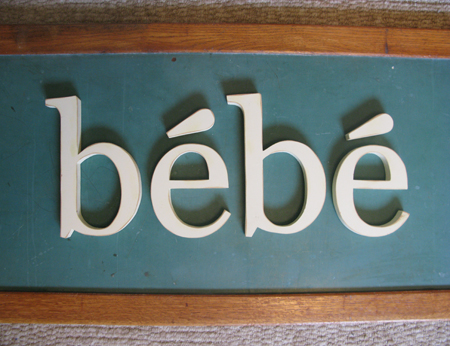
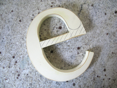
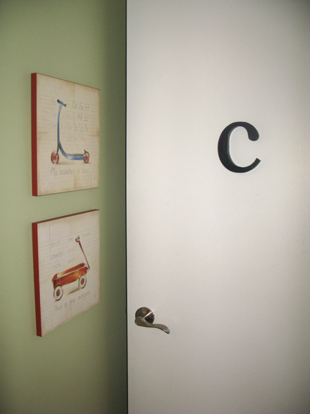
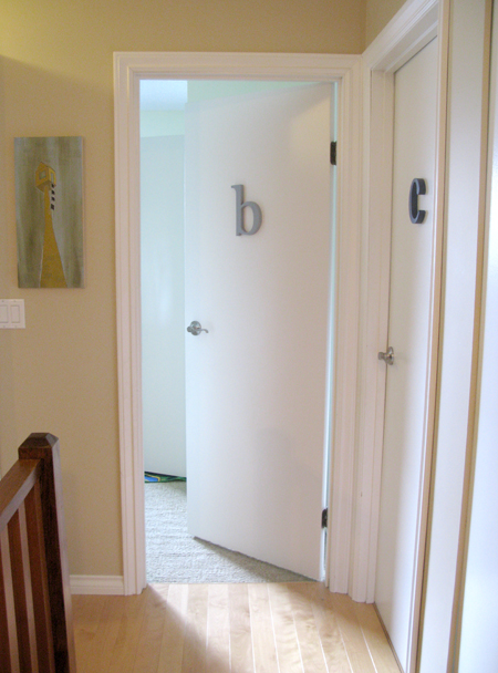
I was given these letters at one of my baby showers for the wall of our nursery. I loved that they spelled baby in French, a reminder of our stay in France. They were up in the nursery of our first home, but never made it onto the wall after we moved into house #2… and now the boys aren’t even close to being babies anymore, so I really can’t hang them now, can I! And yet, I couldn’t bring myself to give them away!

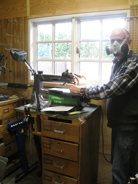
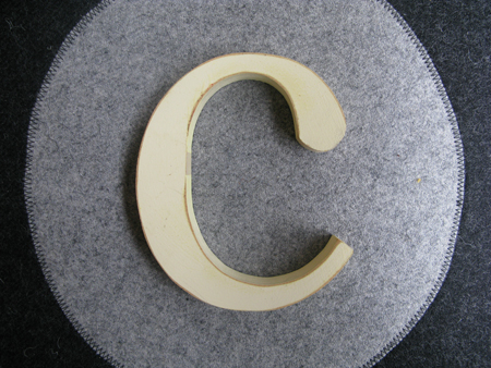
My scroll saw savvy dad helped me change the e into a c! Thank you dad!!

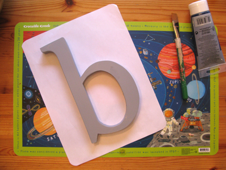
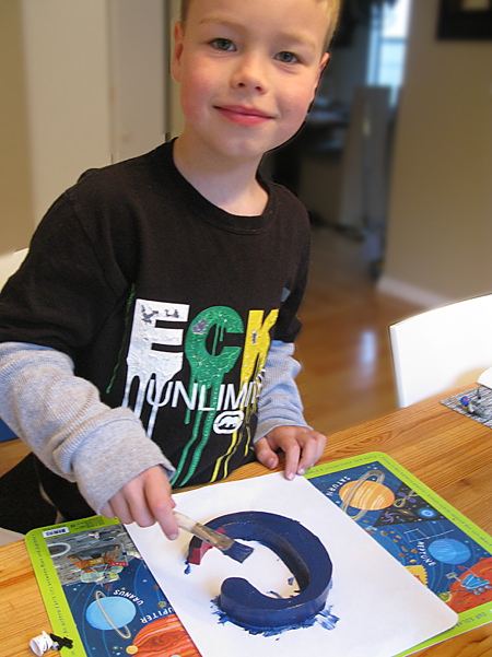
And then I enlisted the boys to choose a color, and paint their letter. The b got a light grey, and the c got a coat red… and then navy.

What do you think? It adds a little interest to the plain slab doors, don’t you think? The boys are so excited about their “new” doors!

Photo Credits: Rosa Pearson Design

Linking up to: Today’s Creative Blog

Type Tuesday: Kids Room Posters

4

22.2.11

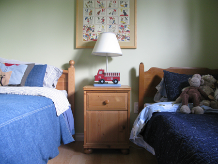
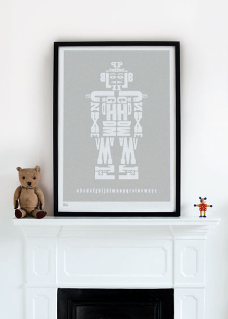
This is the room the boys are currently sharing while we reno the little one’s bedroom. It’s a mish-mash of Ikea and hand me down furniture. All that will be changing down the road. We’ve been advised by our oldest that the alphabet poster (wrapping paper that I bought from a cute little store in Bellevue, WA and framed a couple of years ago) is no longer needed since he knows his letters. So, I’m thinking about replacement posters that will bring some typography to the mix, and a less juvenile feeling to the room. Here are some that I’ve liked for a while:

Matteo Civaschi, H-57 Creative Station via Heartfish Press

Bold & Noble (They have so many beautiful prints!!)

Have you seen any posters that you love lately? Any favorites? Maybe I’ll have to design a poster for their room myself…. hmm??

Type Tuesday: Number Lover

1

15.2.11

Chris Court Photography via Desire to Inspire

Unknown

Cory Gibbons via BlackWhiteYellow

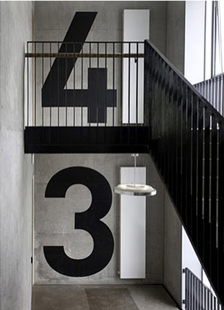
Welcome to the first Type Tuesday everyone! I love the bold and graphic look of all these large numbers. How about you?

Bathroom Reno: Before & After

41

30.11.10

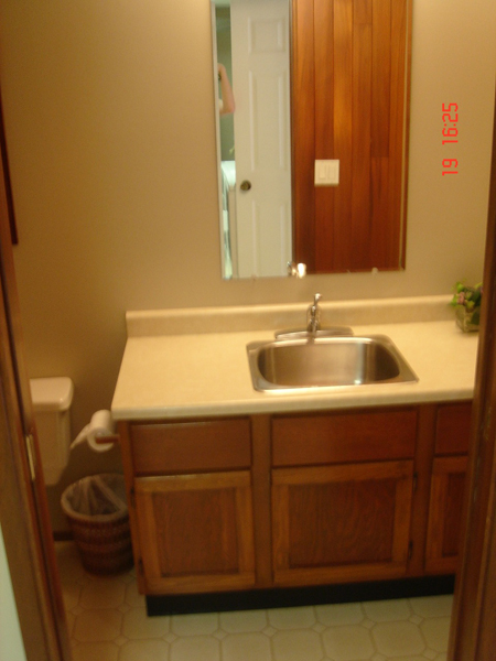
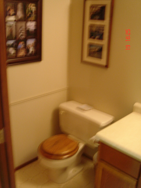
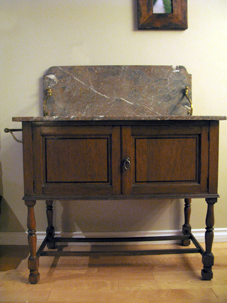
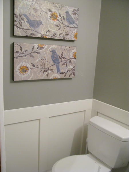
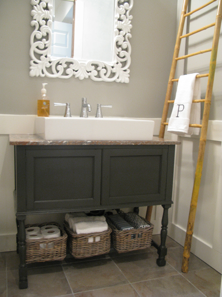
This is what our powder room looked like on move in day. I know! Not pretty. It looked more like an industrial scrub down room than the powder room for visitors to our home. It’s probably best that the pictures are blurry! haha! Not to mention that it also had a suspended panel ceiling – ugh. I sold the old vanity in the above pictures on Craigslist – it was just too large for such a small space. Then I put that money towards buying a freestanding antique console table (with a nod to Sarah Richardson) to make the space feel larger. And for those wood freaks out there, I apologize in advance if this offends, but gray paint won over wood grain this time around.

And this is how it looks now:

All she needs is the perfect pull or knob for the front and the bathroom will be done! At last! And thanks to the hard working hubby for installing the trim, which I’ve wanted since seeing this post. Makes me smile!

Linking up at: Domestically Speaking

Kitchen Renovation: Before & After

16

13.11.10

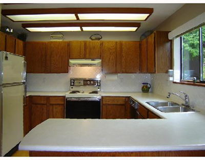
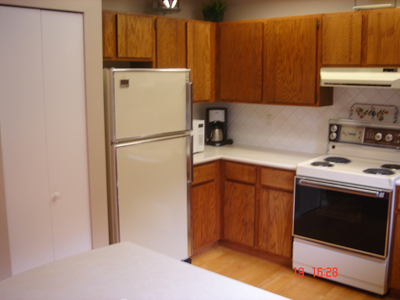
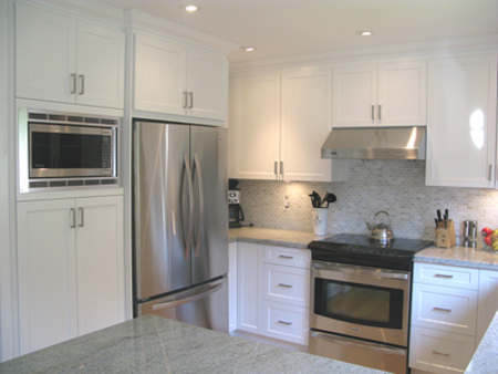
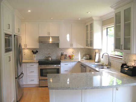
When we first moved into our little house on the hill we knew that there would be lots to do, and we were excited to put our own stamp on a barely touched home. Two years later we are still slowly plugging away at it room by room. Flipping through design magazines has now become an addiction. The first thing we did before we even moved in was scrape all that popcorn off the ceilings. It took ten years off the place! A well deserved facelift. The second, a year later, was the kitchen. This one brings a smile to my face every day. As you can see from the before pictures, the layout was fine, but all the cabinetry and appliances were 30 years old… and don’t even get me going on that “sunshine ceiling”!

The After! As you can see in this picture, there are little things that haven’t been done yet… and some still aren’t. Painting for example. We didn’t want to paint until all the renos on the main floor were done, so we could paint everything at the same time. That will happen very soon since our main floor bathroom is almost done. Can’t wait!

Theme by Blogmilk   Coded by Brandi Bernoskie