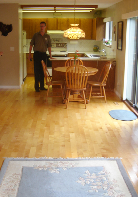
Check out the picture that I found from when the previous owners lived here, and before we tackled our kitchen renovation! It’s shows a little more of the room than you’ve seen before, so I thought I’d take some pics to show more of the family room/eating area/kitchen. I always hesitate to show too much because it’s a work in progress.
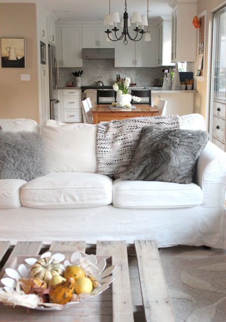
It looks kind of cramped in this picture, but I wanted the sofa to visually break up the long room, and I’m happy with the layout of the furniture. The beige wall on the left is currently the same colour as the rest of the walls, and now that they are all going to get a paint job I was thinking about trimming out and painting that one wall to match the kitchen cupboards. I think it would make the kitchen look a bit wider. What do you think? Keep it the same as the rest of the walls, or treat it like part of the kitchen??
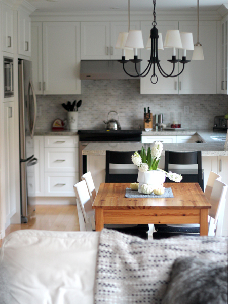
I haven’t shown a view of our eating area before because for the longest time we had no chairs! We borrowed chairs from the dining room while I was waiting to find the right chairs for the space… turns out they were waiting for me at Ikea all along! The table is a hand me down, and we’ve been searching for a long time for the right replacement, but can never seem to decide. And so it goes I guess! Life gets busy, and things fall to the bottom of the list if they aren’t completely hideous. 🙂


37 comments :
Your renovation is beautiful. When we did our renovation, we also put the sofa to break the room – it works really well to define space I found!
how lovely! i agree about painting to flow with the kitchen. exciting! x
Rosa I love your new kitchen and your space is so light and airy! My kinda rooms! Gorgeous! Thanks for sharing:)
Thanks Shelley! Now I just have to spread the “light and airy” to the rest of the house! 😉 That should only take a couple of years, haha!
Lovely Rosa. The kitchen is perfect.
Such a beautiful and cozy home you have! I want to jump right into your post and onto that comfy white sofa! LOVE what you guys have done with the place:)!
These two rooms just can’t be compared…OH MY WORD what a difference!!! soooo beautiful! I think you should paint the wall to flow with the kitchen =) what ever you decided I know it’ll be FAB as usual!
Your reno is STUNNING. You guys did SUCH an amazing job!! WOW!!
Wow, great job Rosa!!
So great Rosa! Love it! Especially the flow of white, so I would continue with the white on the beige walls. We have one of those lambswool pillows from West Elm on our bed. Wish I had a white couch to throw it on too! You inspire me to do a before and after post on our kitchen!
Thanks Cate!
I’m so excited about painting that wall now! Just have to wait until I’m not sick with the flu!! I’m down for the count right now.
My pillow is a look alike I guess, Cynthia Rowley. I picked it up at Homesense, which is kind of like HomeGoods/TJ Maxx I believe?
Would love to see a Before & After of your kitchen!
Rosa your kitchen is amazing! We have similar taste, I wish I did my back splash with the marble tile…. We opted for subway tile but I guess it’s an easy fix (kinda) anyways, looking forward to your invite for a glass of wine over at your house ….. KITCHEN PARTY at Rosa’s!!!!!!!
Very Calm and Restful Rosa! I love the choices you made.
oh em gee it’s gorgeous! such an improvement. I’m drooling over your pallet coffee table… umm yes please! do you have a post on that little gem… so perfect.
Thanks so much Sara!!! Yes, I did a post on the pallet table, you can find it here… http://flutterflutter.ca/2011/12/09/diy-pallet-coffee-table/
What a beautiful, fresh kitchen. Love it!
completely and utterly gorgeous! Janell
Looks gorgeous! Looooove it all Rosa. Never hesitate to show us your progress…it’s fun to follow along on your decorating journey!
Thanks for visiting my blog today!
I love discovering new-to-me blogs through the comments section, and I just read about a month’s worth of your posts.
What a HUGE difference in your kitchen. It’s hard to say what to do with that wall without more context….but both colors are pale enough that it seems hard to go wrong.
Heather
I love your kitchen and adore the colors in your back splash tile! The whole room looks entirely different… I’m also always a big fan of beautiful walls with moulding on them, so that’s my vote!
Thanks Anna! Great to hear you agree! I can’t wait to get it done! 🙂
Have a great weekend!
Rosa
wonderful to see your beautiful kitchen from this angle! it’s just stunning. i’m thinking that yes…you should paint one wall to match the kitchen cabinets. love your new chairs! i would suggest a round table. you are like me…i think and think and look and look for such a long time before finding just the right thing.
and if you are having trouble selecting your other paint colors you should try Kuler. Have you heard of Kuler? It’s an Adobe program where you can create your own color palettes, or have one generated automatically from a photo. http://tv.adobe.com/watch/creative-suite-podcast-designers/discover-adobe-kuler/
Your kitchen nook reno looks lovely. Layered, soft, simple & fresh. Love all the gentle greys and white with just a punctuation of black. Looks like a nice place to just relax with your family. As it should be….happy snow day. Heather
Lovely soft layers of white & grey, especially with just a few hits of black to punctuate. Looks like a nice place to spend time with your family…just as it should be. Best, Heather
The IKEA chairs remind me of your little kid chairs that you numbered. Any chance there is numbering in the future for these ones too?
No numbers for these guys! I’m liking them as is. 🙂
Thanks for stopping by to say hi on my blog! Your kitchen is absolutely stunning! Such an amazing transformation!
Rosa, your kitchen is beautiful. I LOVE it! Such an incredible transformation – hard to even tell it’s the same space 🙂 …I think your idea to trim & paint the wall the same as the kitchen is a great one. Can’t wait to see what you decide to do!
What you’re sharing of your home is so fresh, warm and inviting! I’m in love with your kitchen too!!!!
Victoria
Thanks for the look into your home. It’s lovely! You guys did a fabulous job with your reno. I like your idea to paint that one wall the same as the kitchen cabinets.
What a beautiful transformation. So light and airy. Love the pallette coffee table!!! I really enjoy reading your blog.
Hi Rosa,
I am so totally impressed with your renovation. Really. You have completely transformed the space to something great. Here from Cottage and Vine today,
Camille
Hi Camille!
I’m so happy to hear from you! Great to hear you’re enjoying my blog! Thank you!!
Rosa
I found your blog through Emily Clark, and I love it! Where did you get the throw blanket over your sofa? It’s such a great pattern!
Thanks you so much Carla! I’m glad you found my blog! 🙂 It’s so great to hear from new faces!!
The blanket was from the throw/pillow section at HomeSense (similar to HomeGoods in the US) and the brand name is Storehouse. I loved how it tied everything together.
Love your cozy home and especially the white sofa. Would love to know where it’s from?
Thank you Julia!! The sofas are from Ikea, actually. With kids, slip-covered furniture is my friend. 😉