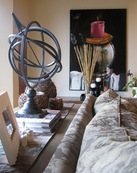
I thought that I should show you a section of our house that may be changing soon! Our living room is the first thing you see when you enter our 1800 sq.ft. home. We do a lot of living in here, so we try to keep it warm and casual, but it has been largely ignored while we’ve been doing renos in other parts of the house. See the artwork in the picture above? That was done by my amazingly talented aunt. I love how her large paintings fill our home with warmth.
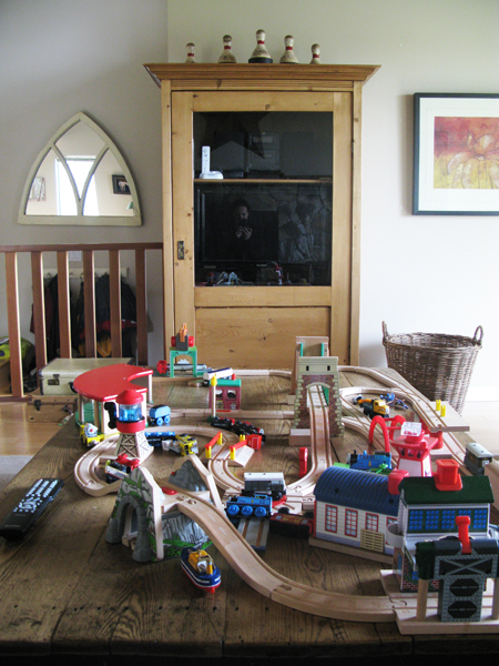
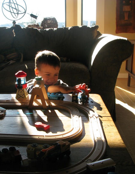
Our armoire stores our second tv, stereo for the kids, and Wii console. Large baskets in the bottom hold the accessories that come with it all! It’s invaluable to have a second area for the kids that I can close the door on at the end of the day. And the large basket to the right of the armoire makes for easy clean up of all the trains and tracks.
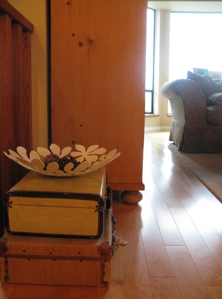
Vintage suitcases are so much fun to store toys in. I want to find at least one more of these, so let me know if you’ve seen one somewhere!!
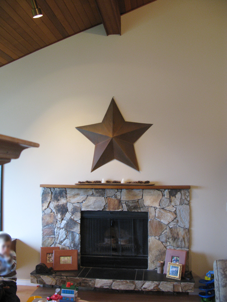
PROBLEM WALL CURRENTLY:
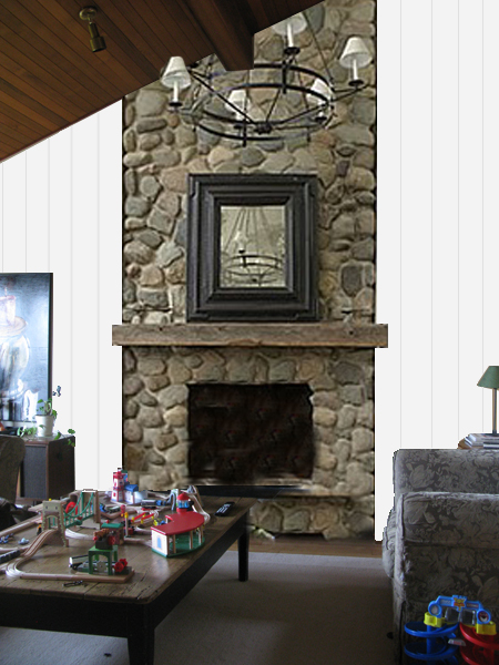
POSSIBLE AFTER:
The two images above show the wall that has bugged me since we moved in. The rather ugly stone, super teeny tiny mantle, and large expanse of empty wall, etc. This is one of those projects that I had planned to tackle the moment the keys were in our hands… but other renovations keep being prioritized above it. I think this is going to be the year!
I threw this together in Photoshop so you can see what’s in my head for this side of the room. I’m thinking of adding some visual texture with wood trim, painting the whole space white, and a floor to ceiling stone fireplace. And a CHANDELIER!!! I’m very excited about the whole thing! What do you think? I’m imagining 1″ wood strips from floor to ceiling to give the look of board and batten siding without the expense of cladding the whole wall in wide wooden planks. Save some money for built in bookshelves or either side down the road! LOL. Any suggestions? Tips? Have you ever mimicked exterior siding inside your home?
Photo Credits: Rosa Pearson Design



7 comments :
That fireplace is amazing. I don’t even think that you would need to add the panelling. With the beautiful ceiling and the stone and a big chandelier it would look out of this world!
YES! That would look awesome! Check out Funky Junk Interiors, she did something similar
Ohhhh keep us posted, what a fabulous idea.
Love that suitcase, ha! Your living room looks great as is, but I could totally see that fireplace plan. Happy Friday!
Love, love, love your inspiration picture — I especially love the fat wood mantle. It will be fun seeing what you do with the space.
p.s. I totally agree that you need some sort of dedicated space for the wii/dvd/ etc… I can’t stand looking at all that stuff.
Love the new living room idea. As a photographer, I should comment on what a fab job you did at editing your “to be” picture. Awesome!
nice photoshop work rosa! i happen to really like the stonework on fireplace that you have now. i’m thinking if you replaced the mantel with the chunky one that you have now, and painted the wall a warmer color (something found in the fireplace stones and them maybe hang your aunt’s painting above. or a really cool huge framed mirror. you have wonderful light in your living room! and i love your idea of using vintage suitcases for storage.